The burning passion of his simple mission blazes through countless decades of timeless fashion from the start of his career. Valentino Garavani, simply “always wanted to make women beautiful”. He didn’t yet knew what his hands could bring him into a great couturier of our era. The final touring country to hold ‘VALENTINO : RETROSPECTIVE - PAST/PRESENT/FUTURE’ is fortunately where I reside most of my time, and thus, for a special throrough report, I bring you the 100 collections of Valentino haute, pret-a-porter, and five garments from the latest collection by the new creative directors for the house of Valentino.


The Singapore retrospective will take on a Valentino-inspired design by Christian Biecher, an
architect who has designed civil buildings in France, Japan, China, including a cultural center at
place des Fêtes in downtown Paris.
Christian Biecher said: "The work of Valentino is timeless; like some great modern artists, he was able to work on his few aesthetic obsessions, again and again throughout the years, without ever being out of fashion‘. I wanted to echo a few of these obsessions in the exhibition design I created for this major retrospective; black and white checkerboard, undulating shapes, technical surfaces (i.e. origami) and his everlasting colours of red and pink (drama and love) are the main components of the installation. In order not to compete with the pieces exhibited, the patterns, textures and colours mentioned above are blown up to an architecture scale which rhythm the exhibition space but never blur the vision of the exhibited pieces.”
In the curator-in-chief’s own words, she described the “exhibition [that] pays tribute to a man who has been placed in the history of haute couture as an undeniable ambassador of elegance. His work combines romanticism, modernity and classicism; his silhouettes combine sovereign grace with timeless allure. His style is determined by a graphic line which is sober and sophisticated at once. His designs accentuate the silhouette, giving it fluidity, femininity and sensuality. Forms are clear, fabrics are sumptuous and all collections always possess a large scale of colours enhanced by rich embroideries.”
As we enter the exhibition, we’re welcomed by soft light and an intimate realm between the visitors and the clothes. The exhibition’s lights are dimmed to a certain extent with a controlled temperature to keep the garments’ condition like new. The garments are all up in a box, and is cleverly classified by the theme or color of the dresses instead of grouping it by year. Curator Pamela Golbin decided it this way all because that his works are infinitely timeless and by its year.


Throughout his career, Valentino stays true to his values, combining the utmost rigour of execution with a stylistic vocabulary that is astoundingly varied. His approach favours a methodical work made of recurring themes. Through either decorative or purely technical elements, these themes elaborate creativity and fantasy.
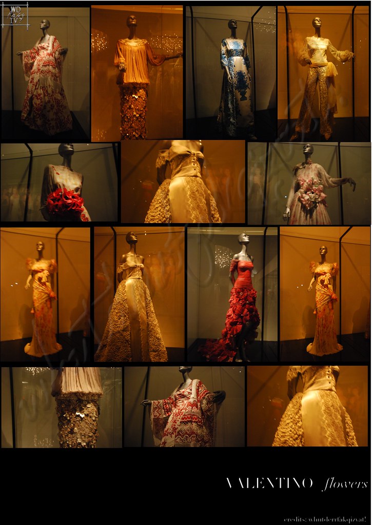
Onto the right of the exhibition, we encounter the section ‘Flowers’. As the maestro’s dream was to adorn a lady with his creations to be as beautiful as a bouquet of flowers. Hand painted flower prints on the dress dominates this section, highly embellished and decorated to evoke femininity and gracefulness where it meets a women body when worn so fittingly.
Ah, yes, the Voghera-born designer loves poppies the most, which is why you can see much of the drawings are of poppy flowers.
First up: the innocent White, Reds and Graphics.
1968 was the year Valentino made his mark: getting a recognition award through this ‘White’ collection, which stabilized him for his house, and the one that set his foot on the fashion ground forever: the very wedding dress of Jackie Onassis and Audrey Hepburn’s gown. While the fashion of the day featured bright and intense colors, the Italian designer presents in January this famous collection. The simple-shaped shift dress is an actual laborious work. The dress is presented with the exact stockings and shoes Jackie wore on her wedding day. Hepburn’s iconic gown is placed right beside Jackie’s dress, and with a more fancy applique on the garment, she wore a sheer polka-dotted stockings with a bow flats.
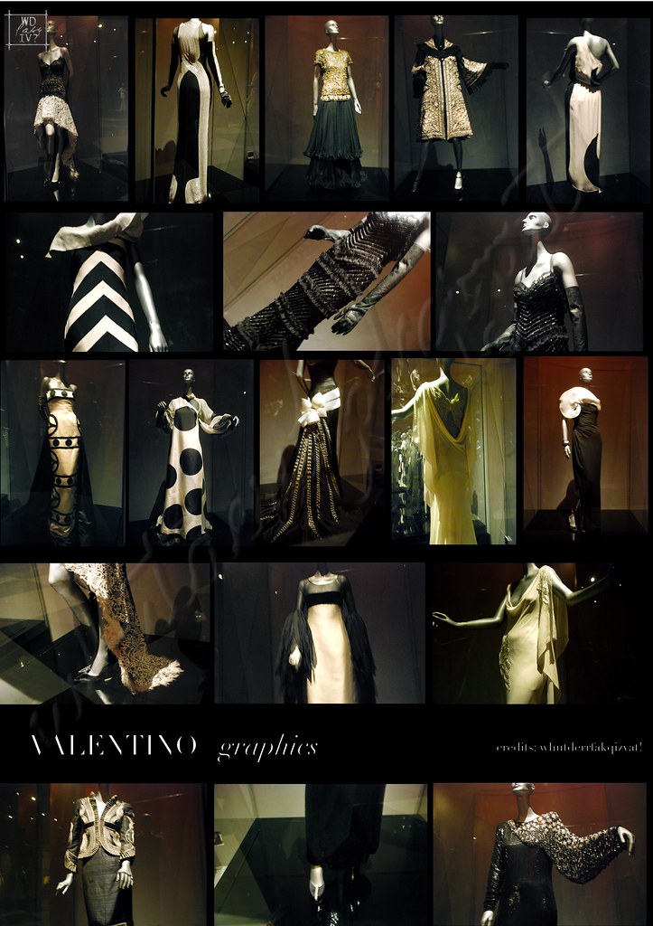

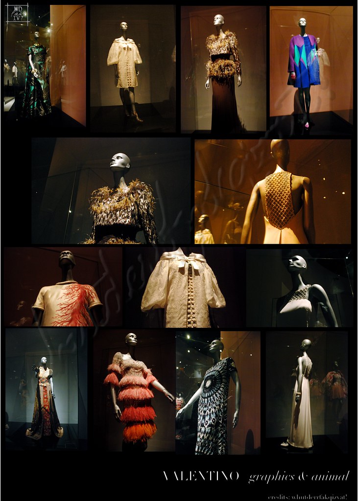
The graphics: geometry, pleats & frills section gives a different flair and feel to the whole Valentino perception. If you think that he doesn’t do polka-dots, well, see it for yourself. A fanfare and theatrical section of furs, feathers and graphical designs of bold lines with sequins and a play of colors and techniques are all here. it gives an unexpected turnout: mostly black, sometime white, the straight lines divide, and then join together in circles
or arabesque forms that transmit a bold stance, utilizing a complete color palette rather than focusing on a color for a collection. The crepes and silk chiffon are pleated, ruffled, and braided to create a
silhouette that is light and airy at the same time. Using feathers as a juxtaposition of vivid
accents, Valentino enlivens his creations and underlines with finesse their perfect cut.
The dresses of black and white isn’t just a dress that’s been printed from the textiles that way. As these were haute couture dress, all are painstakingly done with hand, and to join the black and white pieces together needed great attention and skills, especially on a bias line, to be able to sew them up as seamless as possible.
 This section is quite a breakaway and a view to see up close of his works that are not necessarily silent feminine, which is always Valentino’s image.
The black section below, finesse black gowns with an attention to much detail and ornaments are as timeless as they can get.
The exquisite blacks, the brilliant reds, animal print and volumes are all simply divine.
Sharing a place together with the rest of the collection, we’re first transfixed with an ephemeral dream is the Volume collection. With his constant variations, he associates the balance of shapes with
the curve of volumes, creating sumptuous ensembles where the aesthetic of the detail transforms
itself into an absolute necessity. Constructed with a lightness of touch, his creations reveal a
graceful silhouette and convey a fluid sense of movement. The waist is always emphasized and serves as an anchor point to the design ensemble.
But beneath all these graceful gowns, tedious work and time has been given to create them, each is made with many techniques, such as this woven fabric of many colors in this Animal section of the exhibition. Animal prints are constantly revised, assuming surprising forms in countless interpretations.
Inspired by the stripes and spots of giraffes, zebras, leopards or tigers, these stylish motifs serve to
underscore the sinuous curves of Valentino’s designs.
The fiery red fabrics that catches attention from far is Valentino’s first signature color. The color that represents passion, sanguine, love, and even death was reportedly inspired by a flashback to his teenage years during a trip to Barcelona, when Valentino attended an opera and marveled at the women sitting down in their booths forming a basket of red flowers. Sensuous and powerful silhouettes dominates the collection.
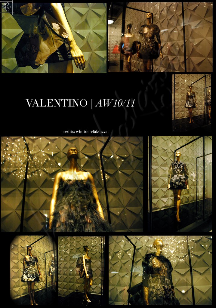
Finally, the latest collection: 5 garments from the latest A/W2010 collection of the Valentino house, designed by the newest creative directors. The designs are given with a modern and youthful touch to cater a new target market - the younger crowd. Sexy and playful cocktail dresses finished with feathers, chiffon, brocade, and accessorize with lace masks is a Valentino reinvented in this century.


Rosso. It sums up the firing passion that slashes all the decades passed of the designer who is vibrant and lively yet reserved in a sophisticated way. It overwhelms to a person who truly understands such punctilious work of creating fashion. The intricate detailing and techniques in the makes for each haute production can't be explain in words; only time and dedication can tell how fantastic it'll turn out too. Valentino may have yet stepped down from his house, leaving his legacy to his two new creative directors, Maria Grazia Chiuri and Pier Paolo Piccioli ,who previously have worked alongside with him as the house's accessories designer, but his visions and mission of the start of his fashionable journey will live on forever.
I was there! I went there with my classmates of the level as the school planned it out. If you truly want to scrutinize all the little sequined details, you could take more than 2 hours to view all the hundred dresses in the venue.


I hope you all enjoyed the post and a visual journey through Valentino's realm of creativity! Best viewed and experienced if you are there yourself. Click on the images for a bigger view.
Please credit photos as texted. If you like the photos from the 'poster' layout and would like to them in a single file, drop me a note with your e-mail and yada yada yada! I'd be glad to give you esp. if it's for school research.
**
*
Achtung! wait, before you leave, another reminder! In support for the lovely book-a-zine CIRCUS where I introduced back last year, and for those of you who hasn't got a chance to get a glimpse/hands on it, you could win a copy from Eye Candies! Head over there for more details, and if you like the book-a-zine and is familiar/have it, please support the next edition, VOYAGE, here! (And so I can kickstart in the work I'm going to hand in to them. ;D) I'll leave you here with what it looks like and an excerpt of a beautiful editorial I love inside.
Pardon! Well, guess it's time to share although I know none will do care!
It's been a while and now I'm quite frequent compared to the days where I joined early 2009 and it was so quiet.
T w e e t C l i c k M e !
I tweet my latest blog posts and art projects I undertake, East Fashion worshiper, insider scoop of what happens during press cons of the lovely Korean idols, and random musings on my gastronomic journey. So if you have the same interest, holler up!
Or, more like chirp.
![[whutderrfakqizvat]](https://blogger.googleusercontent.com/img/b/R29vZ2xl/AVvXsEiYZBZMviKvEin_FsAGumBrMwpAZHcRJZO7rzq_RFYhocc90XMb6y82q4hjpnpw_ijPTAWaiReNmoQc7ham43kbZ1YiY3-qqr2rKvo7iTYPiRgkKM4BTx_5PPEx7p1GH7WBLYsAKz8e9KQ/s720/banner+4.png)